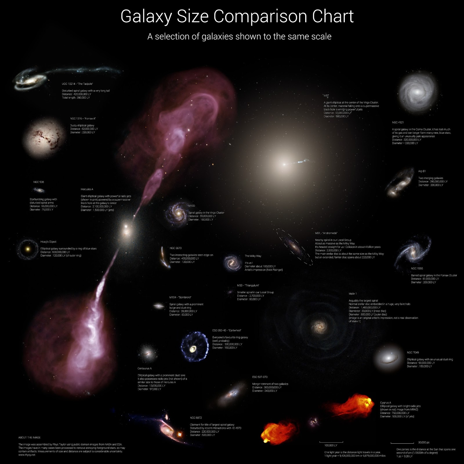
Think the Milky Way is a big place? Think again — check out this graphic by Arecibo astrophysicist Rhys Taylor, which neatly illustrates the relative sizes of 25 randomly-selected galaxies using images made from NASA and ESA observation missions. It even includes a rendering of our own remarkably mundane galaxy at the center for comparison.
(Warning: this chart may adversely affect any feelings of galactic superiority you may have once held dear.)

This is a great chart! We are studying galaxies right now and this is the perfect supplement. Thank you so much!
LikeLike