I don’t typically post things here about deep-space stuff (just to stay on theme) but this was too cool not to share. It’s a visualization of the Universe made from data acquired by the Sloan Digital Sky Survey and shows the locations (and actual images, in most cases) of almost 400,000 galaxies as if we were in a starship soaring among them at many, many times the speed of light. (Without all the bothersome distortion effects of light-speed travel.)
Really, you’re going to want to full-screen this one. (And HD too if you can spare the bandwidth.)
Remember — those points of light aren’t stars; they’re entire galaxies. Each containing several hundred billion stars of their own. Feeling a bit small yet?
But wait: there’s more.
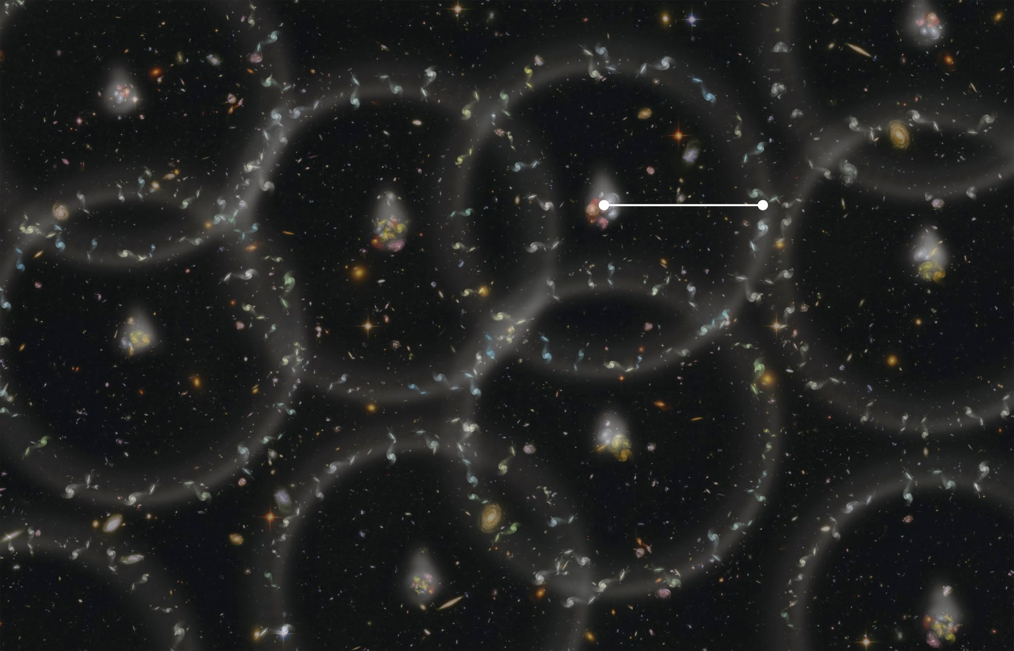
This isn’t even the entire Universe. Far from it — this animation only represents the galaxies out to redshift 0.1. That’s a mere 1.3 billion light-years away from our Solar System… and the Universe as a whole goes on for another twelve and a half billion more light-years. And it’s galaxies all the way down. (Or up. Or out. Whatever.)
Continued research by the Baryon Oscillation Spectroscopic Survey (BOSS) has now mapped the universal structure out to nearly 7 billion light-years… about halfway there, at one percent accuracy to boot.
Let that sink in for a minute and then wonder if we’re alone in the Universe…
This animated flight through the universe was made by Miguel Aragon of Johns Hopkins University with Mark Subbarao of the Adler Planetarium and Alex Szalay of Johns Hopkins.
Source: Berkeley Lab News Center (Aug. 2012 article.)

So great, thanks.
LikeLike
Reblogged this on Laura Daltry's Imagination Blog and commented:
Amazing video, try it.
LikeLike
Thanks!
LikeLike
WOW!
LikeLike
Really awesome !!
Jeff Barani from Vence (France)
LikeLike